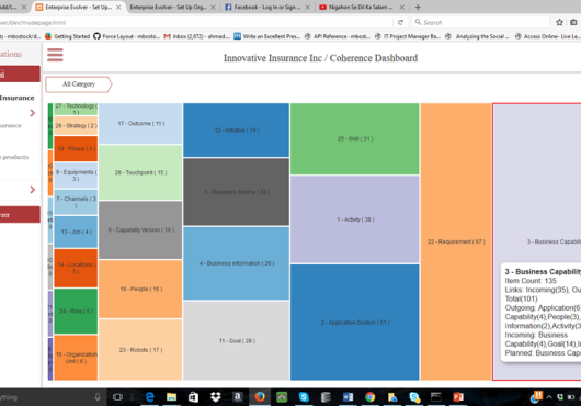
Some new features of Coherence Dashboard visualization tool.
- The Tool-tip contains more relationship counts. When you browse a category, the tool tip will display incoming count (eg incoming associations to the selected category) and outgoing count (eg outgoing association to other categories from the selected category). Further more, incoming count and outgoing counts are broken down into some key categories. For example, when you mouse over on the Capability category, you may see incoming counts for Goals and Initiatives and outgoing counts for Application System, People, Activity etc. Similarly, for each category, the incoming and outgoing categories may be different. At the category level, you will see the aggregate of these counts which will change as you will drill down into the hierarchical data of the selected category.
- The Tool-tip also contains Planned ; Business Capability counts indicating what capabilities are planned for build/enhance using the capability planning features. This feature can be visualized from many lenses such as from Initiative, Phase, Goal, and from any resource which is used to deliver the capability.
- For each association, the tool tip can also display the association type.
- Filter by Tags option on the filter allows you to filter items by filters now. You can filter the dashboard by selecting tags. Any items that are not qualified for the filter criteria will be made invisible.
Lets know what you think about these new features on Coherence Dashboard. If you have any feedback or ideas for new features, please write to us through this link .